
Timeline Charts in Project Management
Francesco Marcatto13 Dec 19
Table of contents
Timeline charts are one of the smartest and most mind-friendly tools for displaying the progress of a project over time. In this article, we’ll see why timelines are so useful and when to use different kinds of timelines, according to your project needs.
Timeline charts and mental timelines
So, what’s a timeline chart after all? It’s a visual way to represent, err, something, over the passing of time. The horizontal axis represents time, and the “something” is usually displayed by a horizontal bar or line. I’ve been very vague on purpose, since timelines are so versatile that they can be used to represent historical facts, the development of a project, or even what’s happening to the main characters in The Lord of the Rings trilogy.
Timelines are so effective because they mimic our natural way of representing numbers and quantities. This is a clever way of using the very effective and natural spatial metaphor for representing something intangible and hard to imagine such as time. Indeed, our representation of numbers takes the form of a mental number line, oriented horizontally, with small numbers represented to the left and large numbers to the right (in populations with a left-to-right writing system, the opposite in populations with a right-to-left writing system). The same happens for the mental representation of time: in the mental timeline the past is represented on the left side of space and the future on the right (some research references here and here, the curious reader should also read about the snarc effect).
Timeline charts in management
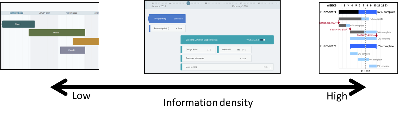
Timeline charts, such as roadmaps and Gantt charts, can be extremely useful for managing different elements of big and small businesses. Of course, different needs require different ways of displaying relevant information. I think it’s useful to distinguish the different kinds of business-related timeline charts based on their granularity and density of information.
On a hypothetical “information density” axis, for example, roadmaps would be far on the left and Gantt charts on the far right of space (see how the mental number line can be used to display and order almost anything? I love this flexibility!). Is there something in the middle?, I hear you ask. Of course, even if they are not as popular as the previous ones, simple timeline charts can be used to communicate project status to clients, stakeholder, and basically people in general who don’t have a deep knowledge of your work, but their opinion really matters.
Roadmaps
Roadmaps are mostly used by product managers for displaying a product strategy. The time horizon is usually quite large, from a quarter to six months, and the horizontal bars represent the sequence of big chunks of work your teams need to do to execute the strategy.
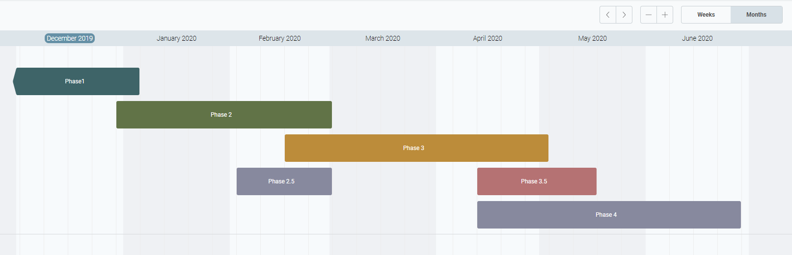
Roadmaps usually display few but very focused information. For example, there are no dependencies between bars or critical paths. In its essence, a roadmap it’s basically a communication tool for sharing the big steps towards success with teammates and stakeholders. Yes, there are starting and ending times, but you should see them as an estimate of duration more than fix deadlines. Simplicity, clarity, and flexibility, these are the three main keywords for building an effective roadmap.
Gantt charts
A Gantt chart is basically a more complex timeline chart populated with a lot of information, such as dependencies between bars, percentage of completion, and milestones. Gantt charts are greatly adopted by project managers for illustrating a project schedule in great detail, therefore the time horizon is usually shorter than the one used in roadmaps, going down to the day-level detail, and horizontal bars represent tasks.
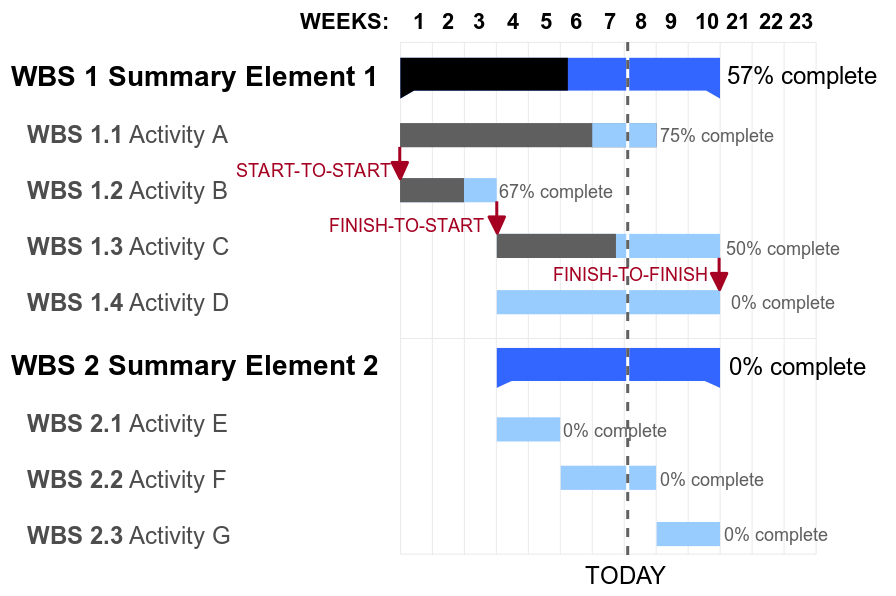
A typical Gantt-chart is full of bars linked by lines (for representing dependencies between tasks), the name of the owner, the percentage of completion, with different colours and shades. This information-rich chart is usually, well, a mess, but it’s a meaningful mess. It’s useful to anyone actively involved in working on the project’s tasks, so they can see what they have to do, when and by when they are expected to finish. They can also see how their piece of the puzzle, be it big or tiny, contributes to creating the big picture.
Due to the information complexity, Gantt charts are not a wise choice for communicating project advancement to people with limited knowledge of what you are doing. Yeah, clients, stakeholders, you name it. They will see a lot of clutter and possibly miss the relevant information. For this purpose, there is a similar, but better, alternative.
High-level timelines for project status communication
Stakeholders and clients usually do not need to see the nitty-gritty of your project, so just don’t show it, and focus on what’s really important only. So take the project-level view of the Gantt chart, remove all the clutter (mostly micro-tasks and dependencies) and keep just the bars representing the main activities over time and their completion rates. What you get is a roadmap-meets-Gantt chart (at Mindiply we call this “high-level timeline” or just “timeline”, if you have a better name please let us know!) which will display how well your project is advancing and will do it in a damn clear way.
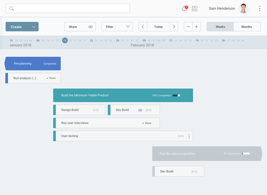
Keep in mind that the design should not always be minimal. The trick is to include everything is needed for having a clear, at-a-glance overview of what’s happening, and nothing more. For example, we often have the need for breaking down big tasks into sub-tasks, so we represent them by using multiple stacked bars. In the screenshot below, “Build the Minimum Viable Product” is the parent task (the big one) and “Design Build”, “Dev Build” and “Run user interviews” are the child tasks (the sub-tasks).
Bottom line
You won’t use a hammer to screw nor a wrench to hammer in a big nail. Each objective requires the right tool. This is also true for the different kinds of timeline charts we have seen in this article. Roadmaps are great for sharing your strategic plan, Gantt charts for representing the details of your project to your teammates, and high-level timelines (again, if you have a better name please drop us a line) for communicating project status and advancement to clients and stakeholders, and giving a easy to understand overall view of your project to your teammates too.
2020 Update: A new tool for Project Management Timelines
If you want to set up an interactive project management timeline that can be modified in real-time, then look no further. Mindiply Timeline is the perfect online tool for creating project management timelines and managing project status reports.
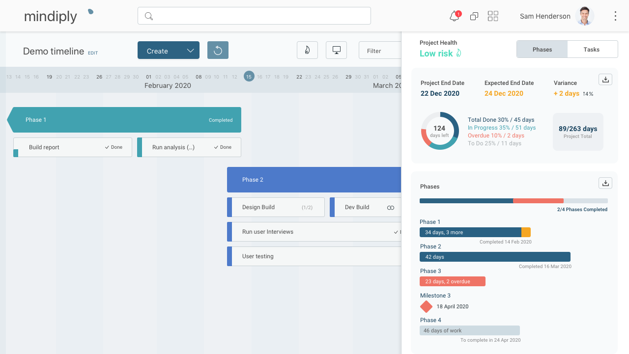
Boost your productivity by reducing team and client meetings. Map your projects’ tasks, milestones, and deadlines in an intuitive way, so you can collaborate easily with your team members. Drag and drop or edit your information in a matter of seconds and make sure everyone is clear about what’s coming ahead and what’s expected of them at every stage.
Ready to create your first Project Management Timeline? Start you 30-day free trial!
Hourglass Photo by Mille Sanders on Unsplash
Gantt chart picture: GanttChartAnatomy.png, Public Domain, wikimedia
Related articles


Take advantage of our free 30-day trial to experience the benefits of Mindiply