Smart Gantt charts: A flexible and content-rich tool for modern project planning
Francesco Marcatto18 Dec 18
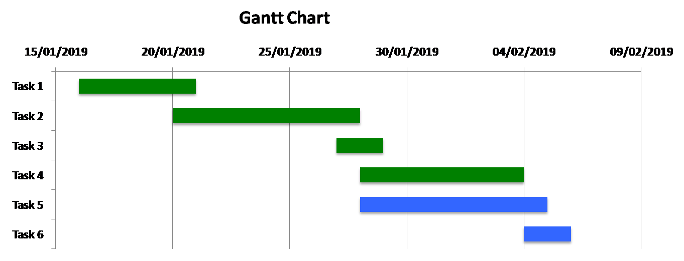
Gantt charts are a very popular way of managing your projects. The main benefit of a Gantt chart is that it is visual: through horizontal bar graphs, you see when tasks should begin and when they are expected to be finished. This pictorial way of representing a sequence of tasks is extremely natural and effective: we think in pictures, and we map time and numbers in a mental number line (think of it as a kind of horizontal ruler, where time flows from the left to the right).
This very effective way of presenting your project will make it easy for everyone to understand what’s to be done and by when. Another major benefit is that it will force you to think and plan a sequence of steps for completing the project. Breaking down a big goal into smaller components brings clarity, increases motivation, and makes everything more actionable. You know, divide and conquer.
What’s wrong with traditional Gantt charts
Not everything that glitters is gold. Gantt charts nowadays are often seen as an old-fashioned, vintage project management tool. Indeed, there are some good reasons to believe that traditional Gantt charts, like the ones you can make with some spreadsheet software, have some serious limitations.
Four main issues have been pointed out by Dr. Harvey Maylor in a research paper suitably called Beyond the Gantt chart: Project management moving on.
The first is the low flexibility. Accurate planning requires a high degree of certainty in time estimates to be useful, however, we are usually not very good in time forecasting (it’s a well-known bias called planning fallacy), so we should expect errors, especially in medium and long-term planning. But when a forecasting error occurs, or you just need to adjust some starting or ending dates, this cascades on all the subsequent tasks and makes updating the Gantt chart a nightmare.
Second, there is no 'why'. You see a chart with a plan but you don’t see why such planning is carried out. There is a sequence of tasks, but people won’t know from the chart the reason behind the whole project and the tasks.
Third, it encourages a one-step approach to planning. Modern project planning is seen as an iterative activity, but when people see the nice, coloured chart, they think it can’t be wrong, so they are unwilling to challenge it, even when they should.
Fourth, being a project-manager tool, they reinforce the idea that the PM is the only one responsible for the time-plan. Practically, they encourage the already control-addicted PM to over control the project, instead of devolving or sharing the responsibility.
There are at least two more well-known major drawbacks of Gantt charts. The first is that they tell you what’s to be done and by when, but not how. By looking at a bar in the Gantt chart you cannot tell what to do for completing the task, nor the resources required. And the length of the bar could be misleading: a longer bar might seem a bigger task when in reality you just can’t tell it by size alone (which indicates the starting/ending time only).
The second is that Gantt charts are not very well suited for reviewing and tracking progress. You can usually just compare the current situation with what was expected to be done, but this is not actually tracking. Some software makes you track the percentage of completion of a task (eg., 40%). This way of tracking, however, can create difficulties in determining progress. In many cases, for example, when you have completed 8 out of 10 activities, task completion is at 80%, but the remaining 2 activities could well take as much time as the first 8 did. In sum, traditional Gantt charts don’t easily allow a project manager to effectively measure progress.
Improved Gantt charts for better project management
Most of the problems presented above are not intrinsic to the Gantt charts, they are more due to the way they are usually created. For many years, Gantt charts have been created first by using the good old pen&paper combo, and later by using spreadsheet software, which can create nice charts but are a pain to design and to update! As you can easily imagine, it is quite hard to update a paper Gantt chart (and even one created with a spreadsheet), as it is adding more content in the bars. Nowadays, new technology can overcome most of the problems of traditional Gantt charts, and make them again useful for modern project management.
Here’s how Mindiply Timeline, Mindiply’s tool for smart goal setting and tracking, has brought new life to Gantt charts.
Flexibility
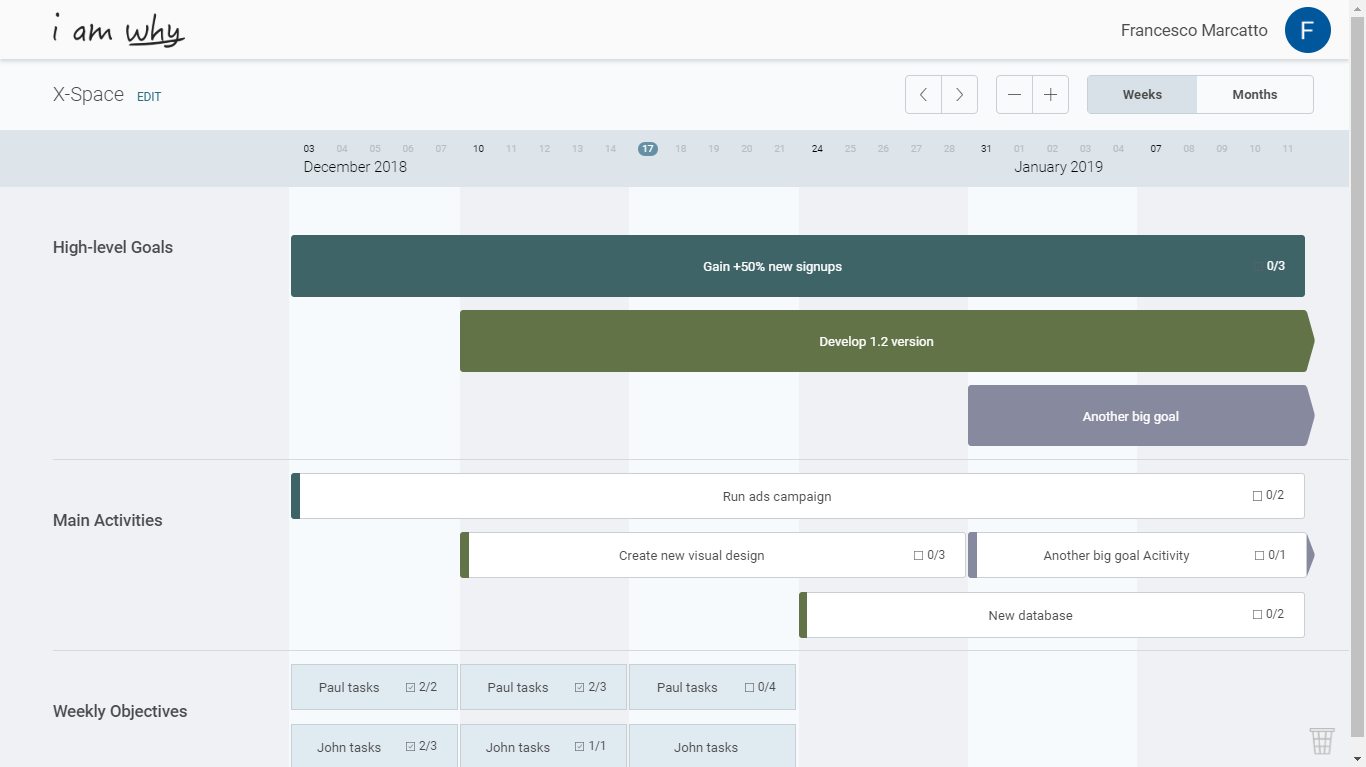
Traditionally, a Gantt chart would have been used to plan your strategy or your tactics. But why can’t you have both? In I am Why the top layer is used to map your strategy, in terms of high-level goals, and you have a second layer where you can break down the big goals into smaller activities, aka the path towards success or tactics. And if you need to break them down some more, there is the weekly objectives layer, where you can have a list of what’s important to do right now.
Easy and dynamic updates
A visual tool calls for immediate and natural interactions. We all know that things can change and no plan survives contact with the enemy, so adjusting and updating your plan can be done extremely easily with drag&drop. Drag a border of a bar to resize it and adjust the deadline, or click inside the bar to move it in another position on the timeline. Fast and easy! The less time you spend on the tool, the more time you have for bringing your project forward.
Rich content
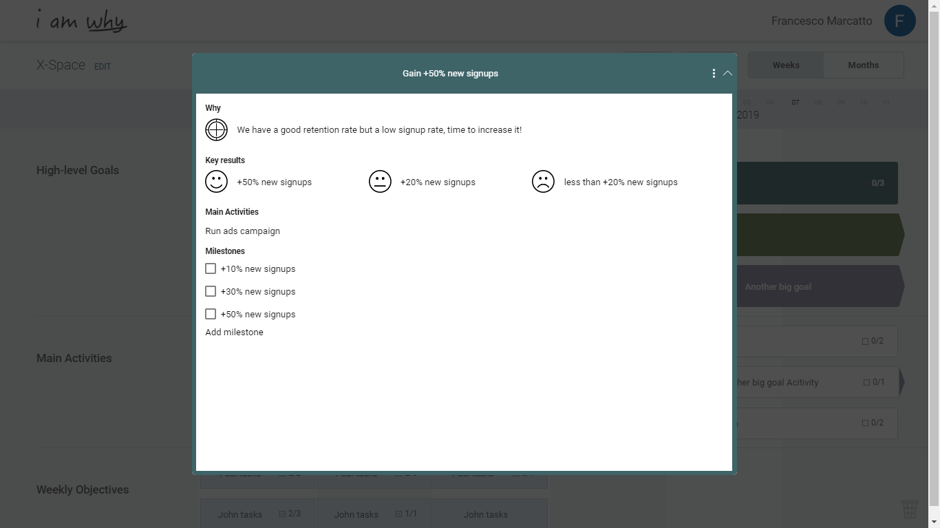
At a glance, in a Gantt chart you can see what there is to be done and by when. But in I am Why there is more than meets the eye: click on a bar and you’ll see everything you need to manage and effectively communicate the tasks: why this is important, who are assigned to this task (this feature is coming very soon, we’re working hard on it right now!), the key results, so you can use the OKRs or S.M.A.R.T. goals frameworks, milestones and comments (another coming soon feature).
Tracking progress
As seen before, tracking progress in a meaningful and accurate way can be very difficult. In I am Why we’ve decided that the main unit for tracking progress are the milestones, that are tangible signs of project advancements. Milestones are easy to count, there are usually just a limited amount of them in a project (while there can be a hundred of tasks), and they can be either complete or incomplete, so there’s no uncertainty in estimating progress (“shall we count this result as a hit or a miss?”).
![]()
Modern Gantt charts in I am Why: An agile and nimble tool for smart planning
You can fly high and plan out your strategy, then come down to the tactical level and define the main activities which will make you and your teams fulfil your goals, and finally go very detailed and write what’s important to do this week. And your plan is not carved in stone: when it will be time to update it or to totally redo it, you’ll be finished in just some clicks.
Say goodbye to micromanagement, project management can be finally a team process: Invite your teammates to the board, plan and decide together activities and key results. You’ll always know what your team is doing, and everyone can be responsible and update their own progress. Motivation and engagement are higher when you use a participative approach, this is one of the main takeaways from the Goal-Setting Theory and Management By Objectives framework.
Now that you know the benefits of planning by using modern Gantt charts, you can start using them for your projects by signing up for free in I am Why!
