The best paid-for productivity apps
John Stanley14 Jun 16
Here at Mindiply, we are developing tools to help you come up with and implement great ideas. But great ideas are just that; what matters is taking action.
In our company, we use some well-known software to keep things running: Slack and Skype for inter-company communications, Trello for keeping projects on track, and Google Docs for documentation and records, amongst others.
But there’s a handful of other software tools that I personally recommend to pretty much everyone. If you are struggling to keep track of your personal projects, want something to assist you in implementing Getting Things Done or Bullet Journal, or just enjoy productivity geekery, read on.
There’s a saying that there’s no such thing as a free lunch, and all the tools below will cost you some money. Are they worth it? I say yes - and I hope I’ve explained why.
I have a very, very strong preference for minimalism as a design aesthetic when it comes to apps, and all the below adhere to that philosopy to one degree or another. And naturally, functionality and aesthetics should be the same across mobile and desktop platforms, right? This is 2016!
But basically, I want my apps simple. Really simple. I used to think an 'online piece of paper' would do me just fine (although Apple Notes now has that covered, and then some). A few years ago I spent a tedious few days testing almost every syncable note-taking application, from Simplenote to Remember The Milk to Wunderlist to the big daddy of them all, Evernote. I tried various permutations of Google Docs and Chrome extensions too.
All of these have a web-based interface that cloud syncs with an app on your phone. All of them offer powerful, whizzy features. All of them are cumbersome, annoying, and/or unintuitive to various degrees - which is a shame, because they were clearly designed to be awesome, but all of them force you to mould your way of doing things via theirs. Despite a raft of “Your life. Simplified.™” type platitudes, they all distance themselves from a sheet of paper in a variety of irritating ways. I particularly don't get the love for Evernote, which I have tried many times but always gave up with due to the various UX issues and general bloat, but it remains hugely popular amongst the productivity glitterati.
Someone must be doing something simple, but brilliantly executed, surely? The SaaS equivalent of a Moleskine? Well luckily, a few people are.
Teux Deux
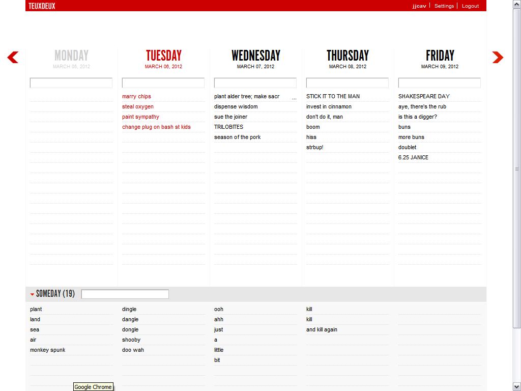
Teux Deux is - in my opinion - one of the greatest organisational applications ever developed. It emerged from the studios of Swiss Miss, a design blog.
Teux Deux is a web-based to-do / calendar that syncs with a paid for iPhone app which costs £1.99. It has a clean, elegant user interface in black and red. Other colours are available, but I've kept things Swiss. It’s quicker to just give it a go, rather than explaining it, but whatever. Things that need doing go in a little text field, get dragged as necessary, and roll over to the next day if undone. Notes or undated things go at the bottom, which you can order as you like. You have a choice between deleting done tasks or crossing them off. (Some people like looking at lists and seeing loads of stuff done and crossed off - I prefer the tabula rasa approach). It syncs with the iPhone without problems, and the mobile app works in almost exactly the same way. No cognitive load, no extra clicks or strokes.
At first I nearly dismissed it for the lack of being able to fool around with the text (I still miss bolding and underlining) but have come to realise that the limitations - such as a character limit - are good for forcing you to condense things to a simple, individual ’actionable task’.
Everything in Teux Deux quietly drips class and design-yness. All the choices that were made were clearly made with a user in mind that appreciates that things should be simple and clear. Yes, they do charge for it - it’s currently $24 per year. If it synced with Google Calendar (I use that as well) it would be truly incredible, but its real value is as a weekly / monthly planner, breaking down tasks into actionable chunks and moving them around.
I've used it everyday for five years. I literally don't know what I'd do without it. Is that recommendation enough?
Clear
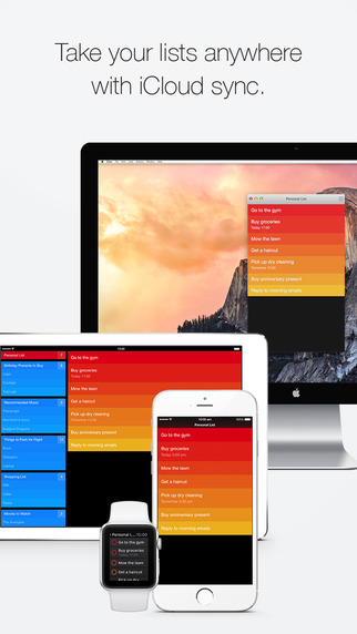
Clear is a task manager / to-do list that boasts that “2 million users declutter their lives with Clear". Made by Brighton based developers Real Mac Software, I learned about it through hip productivity blog The Sweet Setup.
Clear’s real attraction is an extraordinary UI that stays almost identical between the MacOSX desktop app and the mobile app. Adding, checking off and clearing tasks quickly becomes incredibly fast and satisfying - although it’s not an entirely instant, intuitive process to learn. You can add time reminders too, but I found it works best when you have the kind of day with a great number of small tasks (the kind measured in minutes) to do, and more appearing all the time.
It's a slightly intimidating sell. The design is almost totally flat. Colour and sound is used carefully and thoughtfully to add feedback and clarity. The lack of buttons at first seems a little bewildering, but may be a harbinger of things to come; the OSX interface works fine, but this is a deeply ‘mobile first’ application, and it’s natural home is a gestural world where things are swiped and pinched and dragged. A chap called Matthew Panzarino wrote about it in a review:
> “I think that we’re ready to leave buttons behind and enter the next level of smartphone interfaces. Interfaces dominated by natural interaction instincts and not slavish conformity to the conventions of physical buttons. And I welcome it with open arms as I’ve experienced first hand how fast and enjoyable to use this kind of interface can be.”
Clear currently costs £3.99 for the mobile app and £7.99 for the web app. Check out a longer review here.
Dropbox Pro
Dropbox is a pretty familiar application - or perhaps, the word is ‘service’ - to many people these days. It provides cloud storage and backup of documents and files - but so do iCloud, Google Drive, Microsoft OneDrive and many many others. The standard, free service gives you 2GB to play with - useful for a few documents and pictures, but that’s about it.
Dropbox Pro gives you a whole terabyte (1000GB) to store everything. What this means is that you have simultaneous access to, and backup of, all your stuff. I am the sort of person who likes to have everything available everywhere: files, notes, pics, music, films, TV - also, I have a ton of music data files; hundreds of gigabytes that need securely storing and occasionally opening. I looked for a while into a NAS (network attached storage) drive, but realised that a decent one would cost several hundred pounds and have running costs moving into double figures per year. Plus it would likely last a few years at best before becoming obsolescent, and still runs the risk that the drive might be stolen or destroyed in an accident at home.
Now, almost all my files reside in a Dropbox folder, which I link to from aliases across my two Macs and an app on my iPhone, and that’s it. Everything syncs in the background. It’s completely foolproof, requires no maintenance, no backup scheduling, no planning… in fact, nothing at all. It’s done. A problem completely solved. There’s a deep satisfaction in that.
The really clever bit is the ‘selective sync’ feature, which means that the 650GB of files on my home machine (Mac Mini, 1TB drive) don’t fill up my laptop (MacBook Pro, 256GB drive). I choose not to sync some of the larger libraries with the laptop, and we’re fine - I can still access them via the web interface. Plus you can share huge files with other people in seconds. There's plenty of other features too - I particularly like the Carousel feature for photographs, now incorporated into the app.
Dropbox Pro costs £70 a year at this writing. For that, you get a raft of problems and concerns solved and much more extended functionality too. If you need to backup a great deal of data, I think it’s worth it. Well worth it.
Write
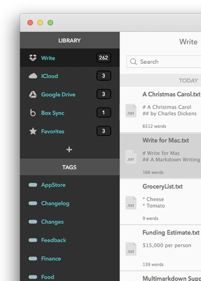
Write bills itself as ‘an elegant, distraction-free writing app’, which syncs between devices using iCloud. There is a lot of competition in this space (e.g. Ulysses), and you have to deliver something pretty special to stand out. Luckily, they seem to have got this one right. Autosave as standard, a very clean, elegant UI, tuneable autocomplete, and many more.
What sets it apart from (say) Apple Notes is a series of very subtle features in the interaction and visual design, that quietly says "this isn’t an app for just making notes. This is an app for people who actually write things". The subtle way the main screen is refreshed on opening a new note. The classy pallette of grays. The anti-distraction features. Also, it exports to RTF files - which are usually a dirty word to anything involving Apple, but to me remain hugely underrated even in a world where file format issues are becoming less of a day to day problem. There's plenty of other cool features to set it apart: have a look here.
If you write a lot of articles, or blog posts (like this one :)) or any long-form writing, you could give it a try. The app is currently $11.99 and the iPhone app is $1.99. Is it worth it? You decide.
Thanks for reading. In a future blog post, I will detail all the physical, offline productivity tools I can't live without.


